Design Inspiration
July 21, 202415 min
Interior Design Movements 2026: Minimalism, Japandi and 8 Other Styles
From Classic to Minimalism, Art Deco to Japandi, a comprehensive guide to the most influential interior design movements worldwide.
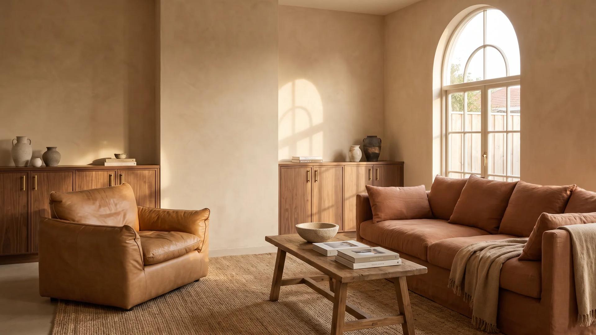
A new era is dawning in 2026 interior design: the cold grays and icy whites that dominated for years are giving way to warm earth tones. Even Pantone's 2026 Color of the Year, Cloud Dancer, the first white tone ever selected, is part of this warmth movement: not sterile, but airy and inviting.
Here we'll cover how to bring warm tones into your home, which material and color combinations actually work, and what we've seen resonate with customers over the past few years.
Our relationship with home changed after the pandemic. Home is no longer just shelter, it's sanctuary. People seek embracing warmth, natural textures, and emotional connection in their living spaces. Warm earth tones deliver exactly that.
Dancing between honey gold and chocolate brown, caramel is 2026's most sought-after color for sofas and armchairs. On velvet it turns lighter and darker with the angle of the light, which is where its depth comes from. In velvet and bouclé fabrics it is the tone that warms a room most.
The reddish-brown of fired earth. A bold choice as wall paint, a sophisticated touch as accessory. A single terracotta vase, cushion, or rug can transform an entire room's character.
Dark, warm brown, the most noble expression of wood furniture. Solid walnut reigns supreme in luxury interiors as coffee tables, consoles, and dining tables. At Archidecors, walnut craftsmanship is the cornerstone of our 45-year expertise.
Matte gold tone. Used in lighting fixtures, furniture legs, and accessory details, brass is the jewel that completes the warm palette. PVD-coated stainless steel ensures quality and durability.
Aligned with Pantone 2026's Cloud Dancer: not cold white, but warm cream. The ideal base color for walls, ceilings, and large surfaces, a calm backdrop that lets other warm tones shine.
Where warm tones create the strongest impact. Caramel velvet sofa + walnut coffee table + terracotta cushions + brass-legged lamp = perfect combination.
The walnut dining table is this space's undisputed star. Surround it with cream or beige upholstered chairs, crown it with a brass chandelier, your guests will look for excuses to sit at the table.
The address of tranquility. Warm tones in the bedroom improve sleep quality, scientifically proven. Warm yellow lighting instead of cold blue LEDs + earth-tone textiles = deep sleep.
| Material | Warm Tone | Application | Care |
|---|---|---|---|
| Velvet | Caramel, burgundy, emerald | Sofa, armchair, cushion | Professional dry cleaning |
| Bouclé | Cream, beige, camel | Sofa, chair, pouf | Dust removal, spot cleaning |
| Solid Walnut | Natural brown | Coffee table, desk, console | Wood care oil (every 6 months) |
| Solid Oak | Honey, natural | Dining table, shelf | Wood care oil |
| Brass (PVD) | Matte gold | Legs, handles, lighting | Damp cloth, NO chemicals |
| Marble | Cream veining | Table top, counter | Sealing (annually) |
| Linen | Natural beige, sand | Curtain, cushion, cover | Washable |
We've spoken the language of wood for 45 years. Solid walnut and oak form the foundation of every piece that passes through our production. Warm tones aren't a trend for us, they're our DNA.
Our quiet luxury approach comes from the same place as warm earth tones: understated yet deep, simple yet rich. In our Grand Soho Hotel (New York) and Katara Hills Hilton (Qatar) projects, we applied the international version of this warm palette, the proof is in the space itself.
Warm tones in 2026 aren't just a trend, they're how we reconnect with our living spaces. A caramel sofa, a walnut coffee table, a terracotta-toned bedroom, none of these are about showing off. They're about comfort that actually feels like home.
If you're curious, come to our Modoko showroom and see the materials in person. Photos never do justice to how solid walnut or bouclé fabric actually feels. Sometimes you just need to touch it to know.
From Classic to Minimalism, Art Deco to Japandi, a comprehensive guide to the most influential interior design movements worldwide.
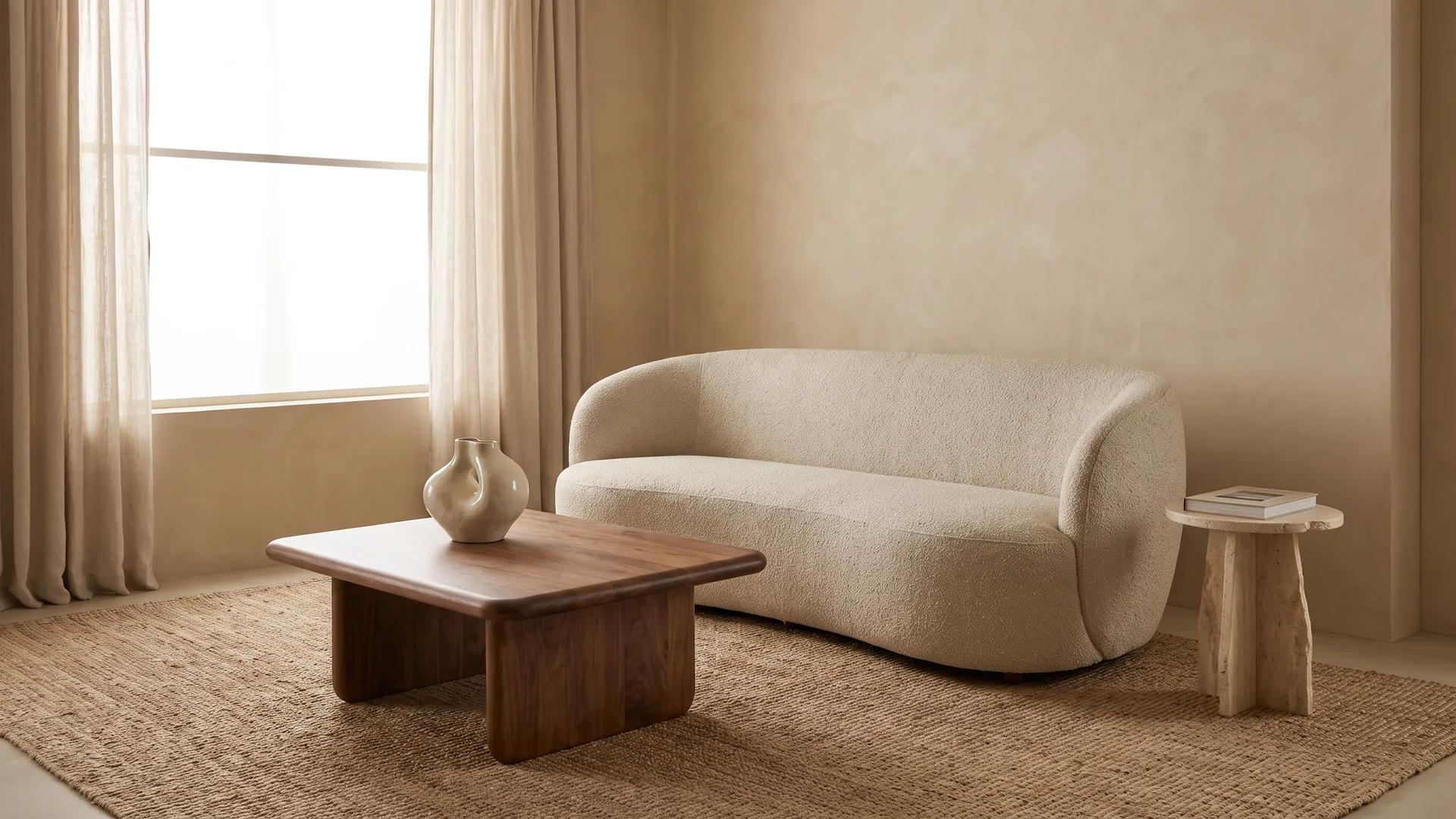
What changed in 2026 furniture trends? Warm minimalism, Japandi, organic forms and the natural materials revolution, expert analysis.
Browse our crafted furniture collection, each piece designed with the same principles discussed in this article.
Design inspiration, new collections and expert guides, directly to your inbox.
Our team of expert designers and craftsmen are ready to bring your vision to life.