Design Inspiration
July 21, 202415 min
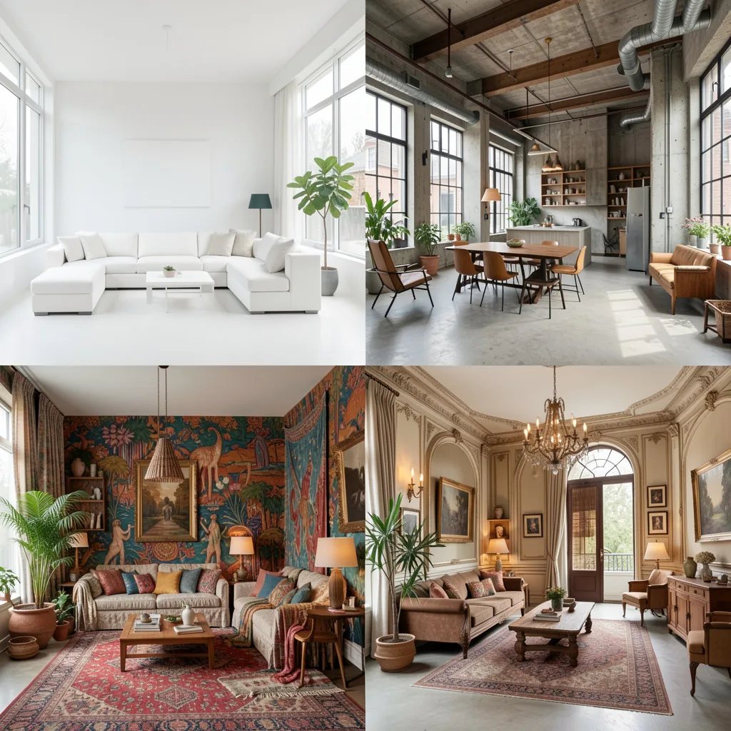
Interior Design Movements 2026: Minimalism, Japandi and 8 Other Styles
From Classic to Minimalism, Art Deco to Japandi, a comprehensive guide to the most influential interior design movements worldwide.
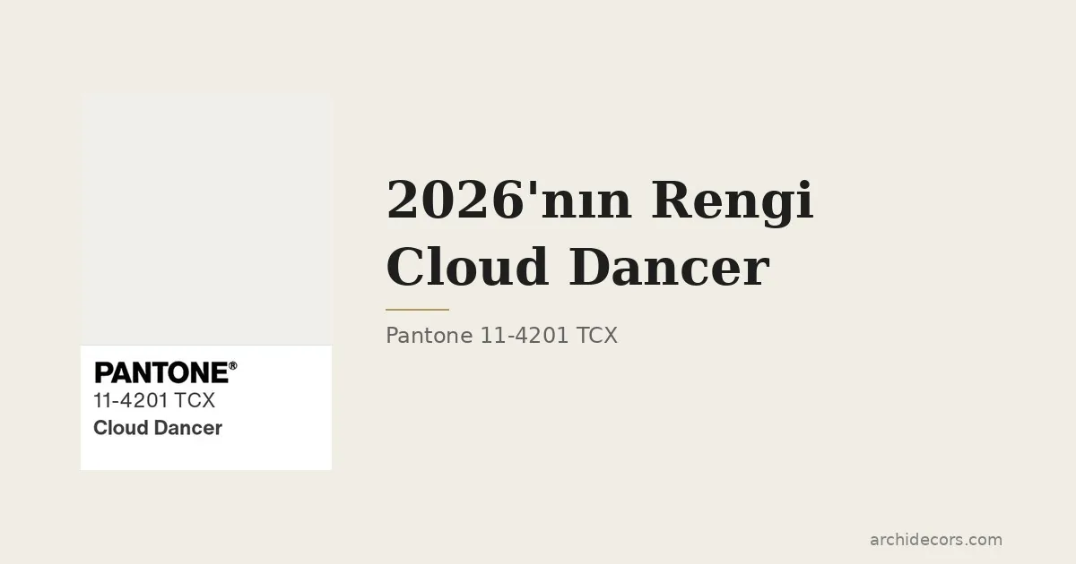
Pantone announced its 2026 color choice on December 4, 2025: Cloud Dancer (11-4201 TCX). The institute has named a color of the year since 2000, and after 26 years this is the first white shade it has chosen. That is not a coincidence; it is a message.
I saw this color first at this year's Milan design week in the Alcova compound, a stand dressed in sand plaster and natural linen. I leaned against the wall and stood there for ten minutes. Back at our Modoko production facility I showed the team and nobody said "that's just white." They said "this white is different."
Cloud Dancer earns its name. Not pure white, not milk white; it catches that moment when light diffuses slowly in air. Pantone describes it officially as "a lofty white that serves as a symbol of calming influence in a society rediscovering the value of quiet reflection." (Pantone press release)

Look at the last three years: 2023 Viva Magenta (bold, brave), 2024 Peach Fuzz (warm, embracing), 2025 Mocha Mousse (earthy, trustworthy). There is a line, from saturation to stillness. Cloud Dancer is the logical next stop. Laurie Pressman, Pantone's VP, told Time it is a "conscious statement of simplification." (Time, December 2025)
Pantone reads every year by the cultural atmosphere. 2026 is clear: digital noise fatigue, burnout from the social media color-bombardment, the maturing of the "quiet luxury" trend. Cloud Dancer is a response to that fatigue.
In our own projects, "calm," "serene," and "easy on the eye" showed up in client briefs twice as often over the last 18 months. This isn't a Milan trend; it is a conversation at every table from Bosphorus villas to Qatari hotel projects.
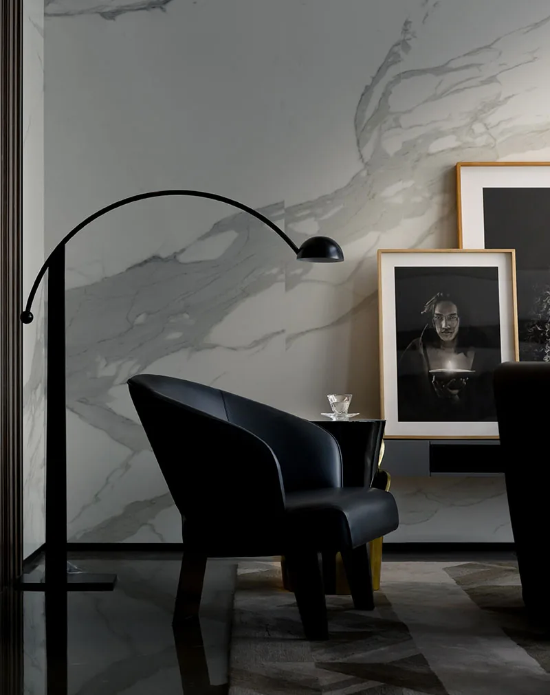
The biggest mistake is thinking "it's just white, roll it on, done." A tone at Cloud Dancer's level works less through the paint itself and more through what surrounds it. On its own it is as empty as a gallery wall; placed beside the right texture, it becomes a poem.
Pantone's own palette suggestions are telling: limestone grey, dark walnut, moss green, patinated bronze. All from nature. Cloud Dancer feels aloof beside a synthetic white; it softens beside natural material.
What I see is this: Cloud Dancer's best friend is texture. Paint the walls, smooth the floor, all the weight rests on the furniture. The linen on the sofa, the raw oak of the side table, the handmade brass detail on the bookshelf. It isn't a monochrome room; it is a multi-textured room.
Think of Cloud Dancer in a living room this way: the wall is the color, the floor is real wood (oak or walnut), the sofa is natural linen or bouclé. Instead of three different whites, one white, three textures. A balance that moves the eye around without tiring it.
Bouclé has been the fastest-growing upholstery trend of the last two years and talks beautifully to Cloud Dancer. Our fabric selection guide covers bouclé's care and lifespan in detail; stain sensitivity in white tones is critical, and the fabric's structure directly affects the decision.
The bedroom is where Cloud Dancer comes home. White bed linen, Cloud Dancer on the headboard wall, a warm brass lamp, an unadorned wood nightstand. That's enough. The rug is raw wool, cream-toned, not white, close to white, keeping contrast low.
In the kitchen Cloud Dancer works as wall paint, but the real story is the countertop. Arabescato or Calacatta marble, white with grey veining, matches Cloud Dancer walls perfectly. Warm wood cabinetry completes the triangle. Our marble guide explains which marble suits which countertop need.
In hotel projects Cloud Dancer works hard. Limestone on the lobby floor, Cloud Dancer on the walls, walnut lounge tables, international guests feel both "Istanbul enough, world enough." We tested this balance many times on the Katara Hills Hilton project; a white tone paired with quality wood lands equally well across cultures.
Cloud Dancer is not a free tone; it comes with strict rules.
Daylight is mandatory. On a north-facing, low-light living room this tone turns grey and feels depressing. The color of artificial light matters too, anything below 2700K yellows it; 3000-3500K is the sweet spot.
Another rule: no plastic. Cloud Dancer lives with natural materials; glossy plastic, metallic PVC, or high-gloss paint look synthetic and dominant next to it. For furniture, choose matte lacquer, natural wood, or real stone.
And let me be honest: the half-life of white trends is usually short. Cloud Dancer is a conversation, not a movement; in marketing it gets talked about for 2-3 years and then fades. But decor doesn't surrender to fashion that fast, a white + natural material formula still isn't boring ten years from now.
Four combinations our studio keeps returning to with Cloud Dancer:
Combination A, Modoko classic: Cloud Dancer walls, natural oak floor, light linen sofa, patinated brass details. Hidden Bosphorus villa aesthetic.
Combination B, Hotel lobby: Cloud Dancer, Turkish limestone, walnut paneling, a single moss-green velvet armchair. Depth and seriousness.
Combination C, Bedroom: Cloud Dancer walls, cream cotton bedding, raw wool rug, brass reading lamp. Neutral but warm.
Combination D, Minimalist: Cloud Dancer, whitened oakwood floor, light grey bouclé, black iron contrast. Where Scandinavia meets Anatolia.
For more palette inspiration our inspiration gallery holds current collections; several projects on the Cloud Dancer road will be added there in the coming weeks.
Is Cloud Dancer yellow, grey, or pure white?
It isn't pure white; it is a "warm white" with a slight cream lean. The Pantone 11-4201 TCX RGB value sits around #F0EEE4. It reads cream-beige in daylight and closer to pure white under artificial light.
What colors pair well with Cloud Dancer?
Its strongest matches are natural earth tones: walnut, oak, limestone, terracotta, moss green, patinated bronze, cream. Vivid colors (turquoise, magenta, citrus) create sharp contrast; they work as accents but rarely as core partners.
Can I paint a whole room in Cloud Dancer?
Avoid the single-tone principle, an all-white monochrome room feels sterile. If wall, floor, and ceiling are all the same tone the room can't follow daylight's shifts and ends up feeling clinical. At minimum the floor and large furniture should differ in texture or tone.
Will Cloud Dancer stay relevant past 2026?
In the short term (1-2 years) it will appear often in marketing; by year three it becomes ordinary. But the formula "textured white + natural materials" is not a trend but a principle, still valid ten years from now. The Pantone color is temporary; the principle stays.
Cloud Dancer is 2026's mirror-holding color. People are stepping back from routine, from screens, from over-stimulation, and asking for quietness. A color alone can't answer that longing, but with the right material and texture it gives the room that feeling. A proposal worth testing calmly for anyone who wants a real room that builds on principle rather than fashion.
From Classic to Minimalism, Art Deco to Japandi, a comprehensive guide to the most influential interior design movements worldwide.
What changed in 2026 furniture trends? Warm minimalism, Japandi, organic forms and the natural materials revolution, expert analysis.
Browse our crafted furniture collection, each piece designed with the same principles discussed in this article.
Design inspiration, new collections and expert guides, directly to your inbox.
Our team of expert designers and craftsmen are ready to bring your vision to life.
Get a quote for your project
Get Quote